This post is sponsored by Open Campus at The New School, which offers continuing education from the university where progressive minds come together.
As a graphic designer, I'm more accustomed to planning layouts by focusing on aesthetics rather than "How is this going to read to the viewer?" or "Is this information digestible? Is it done in the most effective way?"
I started off my career doing visual design, and then through freelancing, I started to do more web design and app related projects, which began to introduce me to the idea of improving user experience through data-based design. But as much as that interests me, the organization of information and its effectiveness hasn't been my strong point.
That brings me to the Open Campus at the New School and their latest short course on Data Visualization. When the editorial team at Career Contessa approached me about whether I wanted to take the class and report on my experiences, I was like, "Uh. Are you kidding me?!"
First, What Is Data Visualization (And Why Are We All Talking About It?)
I'd heard plenty about data viz (for those in the know) before this. It's a buzzworthy skill, especially in design and tech circles, and more and more companies are hiring for specific data visualization roles.
That said, if you'd asked me a few weeks ago what it was, I would have probably said something like, "Oh, it's like...charts and infographics and, you know, bar graphics."
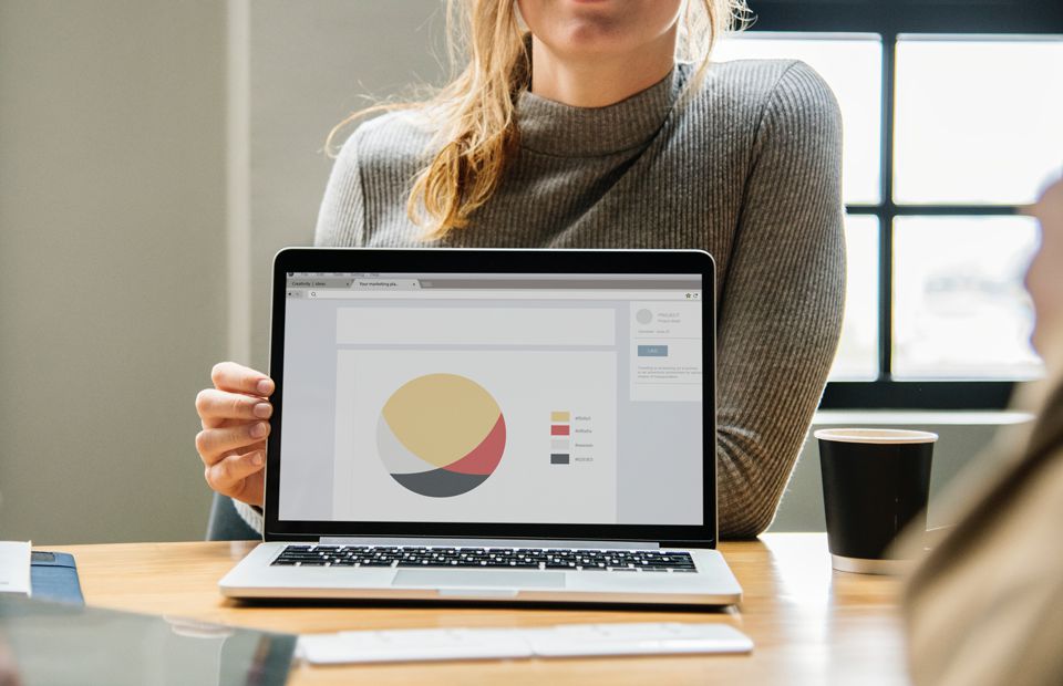
Turns out, that's barely scratching the surface. One of the first things we learned in the course is this: infographics are very static and one-dimensional. But when you're doing data visualization, it's highly interactive.
As I sat in my first online lesson, our instructor used an example from her own work—a bar graph that she designed to show in which countries female mutilation practices were most prevalent. Depending on how she changed the information that she input, like whether those who thought the practice was acceptable were male or female, the graphic would change.
It was something you could see in real time, a graph that was dependent on the viewer and what information they wanted to see. It allowed you to see the answers in different circumstances. In that moment, I realized this wasn't about static design anymore, but more importantly, that it could change the conversations we have around difficult topics from culture to politics. I was hooked.
I'm only a few weeks into the class, and I'm already realizing that this is one of those skills I didn't know I needed—but that I absolutely did. Here are a few takeaways for how data visualization is helping my work (and how it can help more than just designers, too.)
How Data Visualization Can Help Your Work
1. It Makes You Go Back to The Source
Taking the course has already made me think more about what I’m designing. I’ve definitely taken a step back from thinking about how pretty something looks. All of that is secondary. It's about making sure that all the information you’re putting out is necessary, important, and also laid out in a way for the readers to understand. It's taught me to focus on effectiveness rather than aesthetics.
2. And Forces You to Think Big Picture
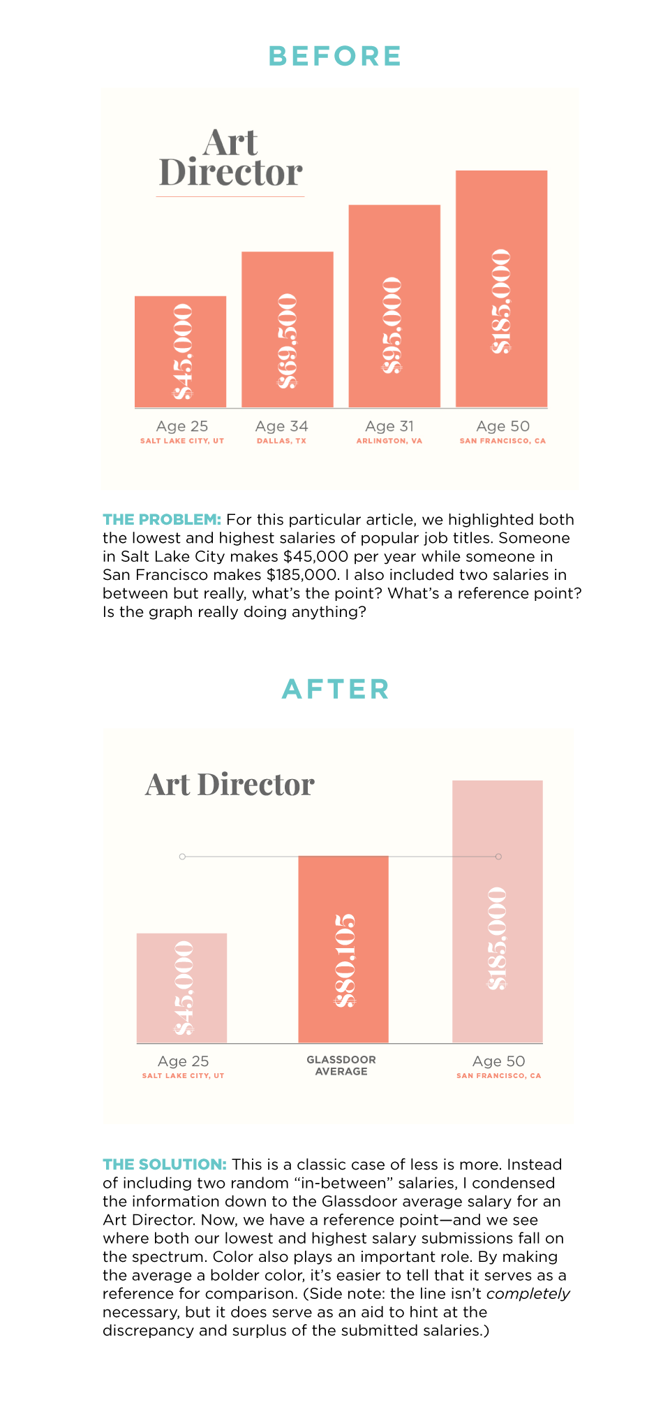
For the work I do with The Salary Project™, I've just been doing bar graphs or big percentages, and maybe a pie chart. But that's so minimal to what it could be. There are so many factors that affect the information and until taking Data Visualization, I didn't realize how much I wasn't representing.
The experiences of women who submit to The Salary Project™ vary so much. There's the difference in age and location but also in years of experience and race. That's valuable information that you should incorporate into a graphic, rather than just making it X and Y. I'm planning on incorporating more information that affects the results to make the experience of those charts more informative and eye-opening.
3. It Helps You Design More Inclusively
As a member of the Latinx community, it's important to me that the work I do for Career Contessa is as inclusive as I can possibly make it. If you don't share the information from people who are different and diverse, you're not giving information at all. Getting data from only white women is only going to help white women. Especially for The Salary Project™, my designs need to represent people from different backgrounds because not everyone's experience is the same.
The salary of a white woman in an executive position is going to be very different than a black woman's, especially when we consider her journey to becoming an executive. She might be a little older. All that comes into play. Applying data visualization techniques to my designs allows me to play into those nuances. And, of course, using real data is essential to avoiding biases that a writer or designer always brings to the table.
4. It Reminds You to Show Not Tell
Like I mentioned, as a designer, I often get bogged down in the question of "Is this visually pleasing?" The information gets across more effectively when you show, not tell, but to do that right, you need what you're showing to be meaningful and thought-provoking.
By showing how data evolves, I can give our articles and content more depth. A lot of Career Contessa's articles include references to studies or research. Through my Data Visualization course, I'm beginning to think of ways that I can better include that data into those editorial graphics so our readers take more away from what they're reading.
5. It's Useful in Industries Beyond Design
I was actually surprised by how diverse the students were in my course. I thought, "Oh everyone here is going to be a designer." But there are people that work in computer engineering, people who work in sales, people that have no experience in design at all, and people from all over the world. Still, as I heard everyone explain what their careers were, I thought, "Oh, I could see how they would use this skill in their day-to-day." It's that versatile and applicable.
6. Data Visualization Helps You Cut Through the Noise to Capture Attention
I know that data visualization is "in" right now, but it's something that should be way more than a trend. Especially now in this political climate. All that research is so incredibly important. As humans, we're not always that great at reading. We're in an era of skimming. If that data were written out, it would probably get lost somewhere. We're reading so many articles now, but since everyone to some extent is a visual person, seeing this information laid out in a way that's appealing to the eye is what's going to make someone stop and read all of it. And that's the goal—those are the stories that need to be told.
7. And Expand Your Skills into the Interactive
I have very minimal experience with design beyond print and more-or-less static websites. But digital media is evolving into video, sound, and everything in between. By exploring web interactives through the course, I'm getting a handle on technical skills I'll use in the future.
8. It Also Improves Your Work in Even the Smallest Ways
I do a lot of freelance work, and the other night I was designing a size chart for a clothing line. That's so basic, right? But even designing that, I thought about what would be the best way to lay it out based on what I've learned. How should I show the U.S. sizes versus the European sizes? What about waist measurements?
I've also been doing a lot of web work as a freelancer, and I can see it affecting that as well. When people want to show results from the work or research that they've done on their website, this is directly something I'd use.
9. And Most of All, It Makes Your "Sell" More Effective
And then there are the media kits and presentations I do for Career Contessa. This is definitely going to affect what I do for those. It's not going to be pie chart after pie chart. I'm ready to make our work more visually diverse, which ultimately makes us a more exciting brand to work with—whether it's Lauren presenting to the University of Oregon and Disney or the pitch decks we give to companies. Data visualization is already leaking into every day.
How Taking an Open Campus at the New School Course Fits My Schedule
1. The Workload is Challenging but Reasonable
I sit down to the class around 7 o'clock-ish after work, and I was surprised to find it was super do-able. As somebody who works full-time and freelances, time is very minimal. I've still managed to work this into my evenings without any sort of strife.
2. You Can Work on Your Own Time But Still Feel Connected
Each week we have assignments—they're not anything crazy. I think that's one of the great things about this course. The instructors really think about "Ok, these people have a full day", so the assignments aren't excessively strenuous. They're also designed to be very good for conversation and discussion. So the people in my class are able to interact with each other by posting videos, projects, etc. You get to see everyone in the class.
3. The Instructor Does the Work Full-Time—So She Makes It Easily Accessible
And then there's the instructor. I was super impressed when I started watching her lecture by how much she knew. She's worked closely with WeWork and tech companies—she's experienced and it shows. She's passionate about starting discussions and how it can apply to your everyday life. One of the first questions she asked us was, "What's one data visualization that you use daily?" And I realized that Google Maps is a data visualization. And the Weather app. Just little stuff like that, that you wouldn't think of. You can tell she lives and breathes data visualization.
-As told to Kit Warchol
This post is sponsored by Open Campus at The New School, which offers continuing education from the university where progressive minds come together.