If you had six seconds to make an impression on a hiring manager, what resume font would you choose?
Recruiters spend an average of six seconds scanning a resume before deciding whether a candidate moves forward. While your choice of font for your resume likely won’t “make” you, it can most definitely “break” you.
Highlighting your skills and accomplishments on your resume is your number one priority; however, it’s important also to consider seemingly minor details, such as your font choice, to have your resume land in the “yes” pile.
Don't put all your hard work in jeopardy because you "really like" using a fancy, unreadable font. Let's explore why resume fonts are more important than you think.
If you're wondering what font wins in a battle of Times New Roman against Calibri, you've come to the right place.
Table of Contents
- Why Your Resume Font Matters
- How to Pick a Resume Font
- Best Fonts for Your Resume
- Worst Font Types for Your Resume
- Best Font Sizes For Every Part of Your Resume
- What are Serif and Sans Serif Fonts?
- More Questions About Resume Fonts
Why Your Resume Font Matters
So why exactly does font choice matter when creating an outstanding resume? Besides the initial first impression, there are a few reasons why selecting the correct font is important.
1. Readability for Humans and ATS
When we refer to readability, we literally mean how easy it is for a human or an applicant tracking system to read what you've written on your resume. If the resume font size is too small or if there are too many italics, underlines, and other creative design choices, the person reading your resume may give up.
Likewise, if you have an unusual font, an ATS may not be able to parse out the information on your resume. At the end of the day, your resume is a digital document. A recruiter or hiring manager will most likely use an ATS to search for keywords. Difficult fonts may prevent your resume from showing up.
By ignoring readability, you aren't giving your resume a fair chance. The content will be ignored because it can't be understood.
2. Accessibility
According to SiteImprove, "an accessible font is a font that will not exclude, nor slow down the reading speed of any [reader], including those with blindness, vision loss, and reading disorders."
When considering the accessibility of your resume, take into account font size, color, and contrast. For example, using a small light gray font on a white background will be difficult for people to read, especially if they are visually impaired.
In terms of accessibility, sans-serif fonts have slightly higher readability than serif fonts. Fonts such as Tahoma, Calibri, Helvetica, Arial, Verdana, and Times New Roman are all great options.
3. Keeping Your Resume to One Page
Font choice is a good way of helping your content fit onto one page. Excluding over-the-top headers and design choices will ensure that you aren't unnecessarily adding length to your resume.
As we mentioned earlier, you have six seconds to make your first impression. Don't allow your font choices to push your most impressive work experience onto the second page of a two-page resume.
4. Some Fonts Distract from the Content
Besides the aforementioned readability and accessibility notes, selecting the wrong font for your resume could distract the reader from the content. Take into account the tone you're portraying through your font choice. Is Comic Sans appropriate for the professional admin position you're applying for?
While typography is an art form, functionality and appropriateness should be prioritized when creating a resume.
How to Pick a Resume Font
Here are five quick tips to keep in mind when trying to find the right font for your resume.

1: When Comparing Different Fonts for Your Resume, Ask Yourself These Three Questions
- Does my resume look professional in this font?
- Is my content easy to read?
- Is this font distracting the reader from the skills and accomplishments highlighted in my resume?
If you’re not sure if your resume indicates professionalism or allows readers to quickly scan your skills and accomplishments, enlist the help of a friend or family member. Getting a second (or even a third) opinion is the best way to ensure your resume font supports your content.
2. Will an Applicant Tracking System (ATS) Be Able to “Read” Your Font
You read that right. Even if your resume goes through an applicant tracking system (ATS) instead of a person, your font choice still matters. If you’re applying for a position that receives hundreds of applicants at a larger company, it is likely your resume will be run through an ATS program.
If you pick the wrong font, an applicant tracking system will read it as blank or as a jumble of squares and...nothingness.
To make sure your resume can be easily read by a computer, choose more traditional fonts. They set the standard for what an ATS is programmed to read. You don’t want your application to be automatically rejected by a computer that is unable to even decipher your resume for keywords.
3. When in Doubt, Play It Safe With More Traditional Fonts
Debating on whether a certain font is acceptable for your resume? If you (or your friends and family) are even questioning it, it probably isn’t a smart choice.
To play it safe, and increase your chances of passing the resume test, stick with more traditional fonts. The most traditional, and common, resume font is Times New Roman. If you’re looking to stand out (in a positive way) while maintaining a professional and reader-friendly resume, consider other fonts such as Arial, Calibri, Helvetica, or Cambria.
4. Consider the Type of Company You’re Applying to When Choosing a Font for Your Resume
When applying for a job, it’s important to tailor your resume to the specific position and company. Different industries and types of roles/companies have different expectations and preferences when it comes to resume style.
Hoping to break into the corporate world as an accountant at a large firm? Stick with Times New Roman or other highly traditional fonts.
Looking to land your dream job as a graphic designer at a startup? Showcase your creativity and eye for design—try out another font on the list of best fonts below to see what fits your style preferences. Regardless of the role/company you’re applying to, your resume font must pass the requirements from Tip #1.
5. Keep It Consistent to Stand Out and Be Memorable
Imagine this: you’re a recruiter sifting through a stack of resumes. All of the sudden you see one that uses five different fonts, various font sizes and colors, and lacks proper formatting. What would you do? Most of us might not even get past looking at the applicant's name before tossing the resume into the “no thank you” pile.
An inconsistent resume style is distracting. It takes away from the skills, experiences, and accomplishments that make you a great candidate. To ensure a consistent look throughout your resume, consider font choices (one or two), color choices (one or two), matching headings, and identical spacing between sections.
Pro Tip: Personal branding is everything. To really make a good first impression and showcase your attention to detail, make your application materials look like a package deal. Mimic the design of your resume when writing your cover letter. This involves (but is not limited to) using the same fonts, colors, and background for all of your application materials.
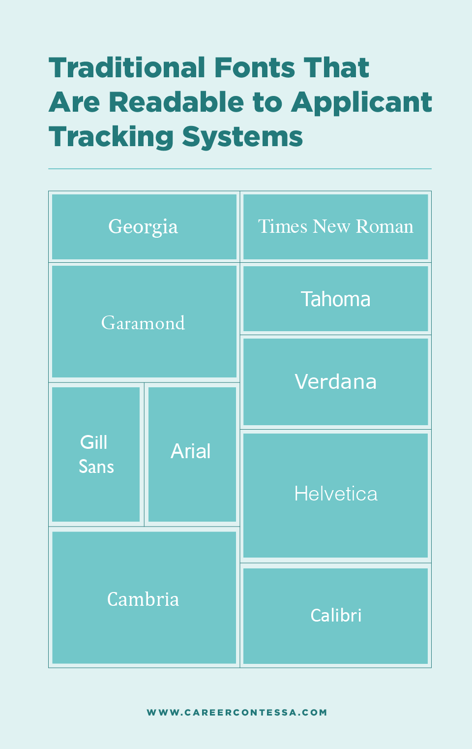
Best Fonts for Your Resume
You might still be traumatized from being forced to write all of your high school and college papers in Times New Roman (and we don't blame you) but it's an old, dependable classic. Here are some fonts you can’t go wrong with.
- Times New Roman
- Arial
- Calibri
- Cambria
- Georgia
- Helvetica
- Verdana
- Garamond
- Didot
- Trebuchet MS
- Book Antiqua
Best Font Sizes For Every Part of Your Resume
Selecting the correct font size is a key influence on the readability and accessibility of your resume.
So what's the best font size?
- Keep your body copy font size between 10-12 point.
- Headers and sub-sections can be slightly larger at around 11-14 point.
Our best tip in determining font size is to do it after you've laid out all of your content. That way you can skew toward a smaller font size if you slightly spill over to a second page and skew toward a larger font size if you have room on one page.
Keep in mind that you can mix and match small sizes and large sizes. However, make sure you keep it consistent. If one of your headers is 13 point, make sure they all are.
Keep in mind that you can mix and match small sizes and large sizes. However, make sure you keep it consistent. If one of your headers is 13 point, make sure they all are.
Worst Types of Fonts for Your Resume
The last thing you want to do is get your resume thrown into the "No" pile because it's in the Papyrus font, but if you don't trust my word, maybe you'll trust Ryan Gosling.
Here are some fonts you’ll definitely want to avoid.
1. Avoid Heavily Stylized Fonts
While modern cursive fonts and bubble letters might add some excitement to your resume, they are hard to read for both humans and ATS programs.
Also—and keep this piece of advice in mind—some recruiters and hiring managers will have an almost incomprehensible disdain for stylized fonts. Maybe you would hate the Chalkboard font if you looked at hundreds of resumes daily.
2. Avoid Unprofessional or Childish Fonts
We're looking at you, Comic Sans. And nobody is laughing.
Communicating your ability to be professional in the workplace is important to recruiters. Don’t even think about going for fonts like Papyrus, Comic Sans, Wingdings, Marker Felt, or Chalkboard.
Is Comic Sans Better for Dyslexic Readers?
By the way, there are some murmurings that Comic Sans is actually more accessible for dyslexic readers. However, most of the support for these claims have been anecdotal. A recent study determined that the best fonts for dyslexic readers were Helvetica, Courier, Arial, Verdana, and Computer Modern Uni-code.
3. Avoid Non-Standard, Downloaded, or Custom Fonts
If you had to download a font for your resume, don’t use it. Anything downloaded from the internet or designed yourself is not standard, and therefore, not readable by ATS programs.
4. Avoid Narrow, Condensed, or Light Fonts
These types of fonts are difficult to read, especially on a computer screen. If you find yourself squinting to make out the text, you need a bolder or more spread-out font choice.
What are Serif and Sans Serif Fonts?
We're glad you asked.
If you still don’t know what font is right for you, it might be helpful to divide fonts into two categories: serif and sans serif. Once you understand the difference between serif and sans serif fonts, you can start narrowing down which font is best for you.
Serif Fonts
A serif font has little lines at the end of each stroke in a letter, making it look more decorative and ornamental. These types of fonts are usually seen as more classic, serious, and refined. If the role or company you’re applying to is more traditional, picking a serif font is a smart choice.
Common serif fonts include:
Georgia, Times New Roman, and Garamond
Sans Serif Font
The word sans means "without." In this case, without the little line. A sans serif font doesn’t contain decorative strokes at the end of each letter, making it look more clean and precise. These types of fonts are opposites from serif fonts: informal, modern, and approachable.
Common sans serif fonts include:
Arial and Helvetica
More Questions About Resume Fonts
Believe it or not, there are lots of questions about fonts. Here are a few questions about using fonts through a job application and interview process.
Can You Use Multiple Fonts?
We highly recommend that you don't use multiple fonts on your resume. Keep it consistent. If you want to differentiate between sections in your resume, play around with font sizes, boldness, italics, and underlines (but don't go too overboard).
What Are Good Small Resume Fonts?
Our advice for the best small resume fonts aligns with our advice for the best resume fonts in general. These are Times New Roman, Arial, Calibri, Cambria, Georgia, and Garamond, to name a few. After writing your resume content, play around with changing the fonts and see what looks best.
What Are Good Large Resume Fonts?
Likewise, good large resume fonts are any fonts that are considered readable and accessible. On a design note, if you want to include a larger font size in all caps for the headers, we recommend going with a sans serif font. All caps serif fonts can look a bit jarring while sans serif in all caps maintains a clean look.
What Typefaces Look Best on Computer Monitors?
As we mentioned earlier, it is highly likely that your resume will be viewed solely on a computer monitor or screen.
There is no research to suggest that either serif or sans serif fonts are better than the other in regards to screen readability. To be safe, stick with common, default fonts. You don't want to force your potential employer to download fonts in order to read your resume.
What Typefaces Look Best on Mobile Devices?
Serif and sans serif typefaces both work well on mobile devices. However, small font sizes on a mobile device are tough to read. Likewise, having too large of a font size may overtake a mobile device screen if not properly formatted.
What Font Should I Use for My Cover Letter?
Our advice for selecting cover letter fonts is the same as our advice for resume fonts. Is it professional? Is it easy to read? Is it distracting? We recommend matching the body copy font of your resume to your cover letter.